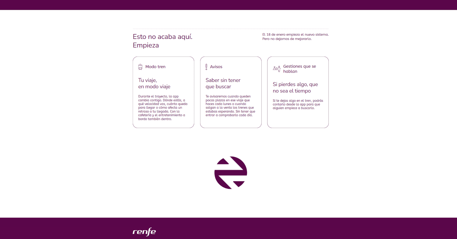
The open secret has been confirmed. After more than 20 years, Renfe is reinstating its traditional “biscuit” as its isotipo (standalone logo mark), as part of a brand renewal process led by the team under Álvaro Fernández Heredia.
This long-anticipated return, speculated about for months, coincides with the launch of Renfe’s new ticketing system being presented this morning.

Alongside the return of the iconic image, there is a shift in the tone of the corporate purple. Renfe is dropping Pantone 2425 C in favour of Pantone 2357 C, a darker, more muted plum shade. The result is more sober and elegant, though less eye‑catching than the tone used until now in the operator’s corporate identity.
The “biscuit” now functions as a 100% isotipo: a graphic element that represents the brand and is entirely independent of the word “Renfe”. Despite its two‑decade absence, it remains clearly recognisable, and newer generations will gradually become accustomed to it.
Rumours of this expected comeback had been building on social media until it became an open secret, with Renfe itself dropping hints. The latest clue was a partially uncovered “biscuit” on signage at the new La Tenería station on Cercanías Madrid – a slip that, while unproven, was almost certainly deliberate.
Confirmation came during the morning, via station announcements and an X post by Álvaro Fernández Heredia himself, posing the question “¿Quieres cookies?” alongside the isotipo.